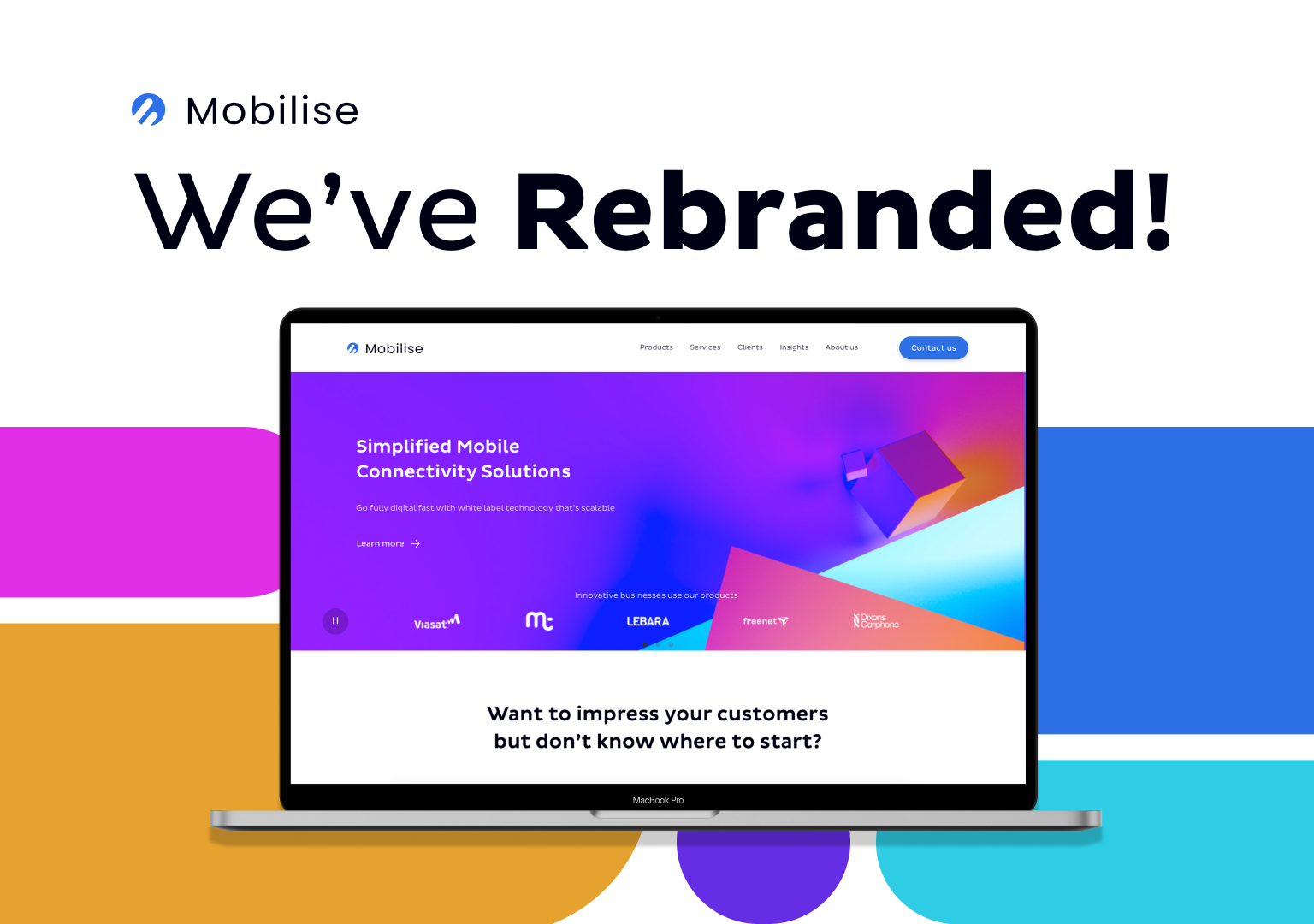
Have you noticed anything different about us? We decided it was time to freshen things up around here and give our website a major makeover. Our team have been hard at work behind the scenes, tweaking and refining every little detail to create a brand-new look and feel that we think you’re going to love.
So, what’s new, you ask? Well, for starters, we’ve updated our logo to reflect our company’s values and mission better. We pride ourselves on offering the most innovative products, and we always aim to reflect that with our brand. That’s why, in 2023, we decided we needed to refresh it.
Our new logo is inspired by Mercury, the God of Innovation. The wings are aimed upwards, to showcase our forward thinking and we kept the circular shape to symbolise stability and collaboration.

We’ve also revamped our colour scheme, opting for a more modern and vibrant colour palette that we think reflects our professionalism, trustworthiness, and stability. And will really make our website pop.
But the changes don’t stop there. We’ve also streamlined our website’s navigation, making it easier for you to find exactly what you’re looking for. We’ve added some exciting new features and content, too!
We don’t want to give too much away, though. We’d much rather you come and see for yourself! So, head on over to our website and look around. Let us know what you think of the new look and feel.
We hope you love the new and improved version of our website and brand as much as we do. We think it’s the perfect reflection of who we are as a company and where we’re headed in the future. Thanks for being a part of this exciting journey with us!


